
Today I’m addressing a question I get asked pretty often, & that’s how I edit my food photos. There’s no easy way to explain it without actually showing you, so you’ll find lots of screenshots in Lightroom throughout this post. I’ll take you through my editing process for my current favorite image from start to finish. Let’s get started!
Step One: Import RAW image into Lightroom & make lens corrections
Below is the RAW image, straight out of my camera. Looks pretty bland & boring, doesn’t it? We’re going to take this photo into Lightroom & work some magic!
Once the image has been imported into Lightroom, I switch to the ‘develop’ mode & scroll all the way down to where it says ‘lens correction.’ I check both ‘remove chromatic aberration’ & ‘enable profile corrections.’ From here, I scroll up slightly to the sharpening slider. I use the mask slider to decide on how much of the image I’d like to be impacted by the sharpening. Then, I click & hold down on ‘option’ on my keyboard & slide the masking slider. The image starts to turn black & white. The white that’s shown in the image is what will be impacted by the sharpening. Once the mask slider is where I’d like it, I jump up to the sharpening slider & sharpen my image. I tend to stick around 85 for sharpening.
Next I move over to the tone curve & up the whites & slightly lower the blacks. I tend to under expose my images ever so slightly, so I find I don’t need to mess with the black all too much.


After completing these three steps, my image really doesn’t look that much different. But it’s these little adjustments that add up once the image has been fully edited. Trust the process!
Step Two: Tone sliders & white balance
This is the part of my editing process where I begin to see real change. I scroll all the way up to the tone sliders & start with the contrast & whites. Next, I’ll adjust the blacks followed by shadows & highlights. There’s no right or wrong order to follow when you’re making these adjustments. It’s just what I’ve always done, so I’m used to it! Last, I’ll adjust the exposure if need be.

Next I’ll adjust the temperature & tint, if necessary. For this particular image I wanted to convey a warm, sunny spring day, so I wanted it to appear a little warmer. I moved the temp slider up from 5,600 to 5,923 to help with that. I also notice that my camera can tend to hang onto green hues, so I almost always adjust my tint slider up towards the magentas.

Step Three: Masking
This is when I really like to take my time to make my subject pop. I click on the little masking circle in the top right corner & click on the brush tool. I brush over the parts of my image that I want to make adjustments to, & in this case it’s the peach crostini. I like using the brush tool (as opposed to the subject mask), because it allows me to be really detailed about where I’m putting the mask. I use the texture, clarity, & dehaze sliders, as well as the hue slider. This is when I can really start transforming & bringing life to my image.


If it feels like my image’s shadows are too intense, I’ll usually lighten them up using the linear gradient mask. In this case, I like the darker shadows, so I won’t mess with them. For this image I only have one mask, but sometimes I can have 4-6 masks if I really want to spend the time making small adjustments.
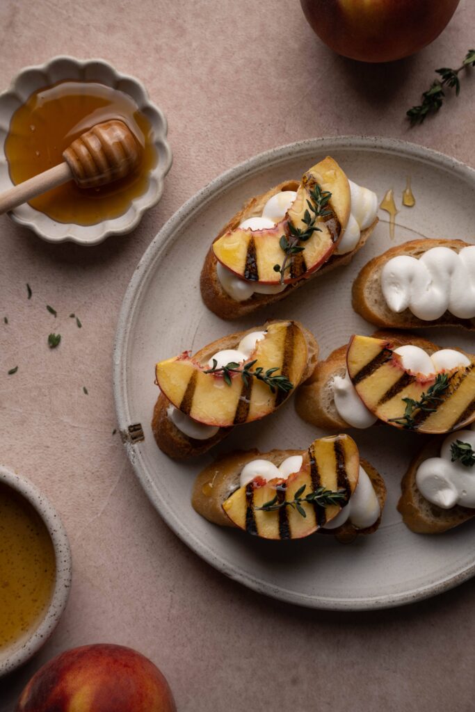
Take a look below to see the differences already with the RAW image compared to the image we’ve started editing.
And just think, we haven’t even dipped into the HSL panel yet! These little edits go a long way when added up. Let’s keep going!
Step Four: HSL Panel & Color Grading
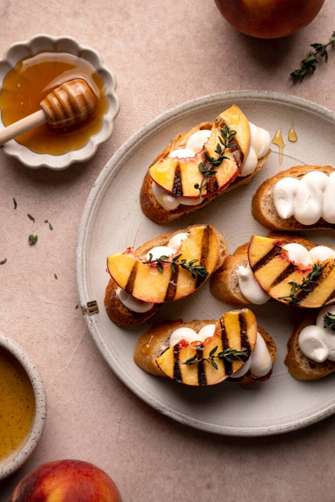
The HSL panel stands for hue, saturation, & luminance. In this step, I’ll focus on the tones & colors in my image. The goal is to make the colors still appear life like & natural, but I definitely want to continue to warm this image up just a touch. Take a look below to see my hue, saturation, & luminance panels after adjustments were made.
I usually always slide my red, orange, & yellow to the left when I’m in the hue panel. I just love the coziness that comes from the pinks & oranges. Remember, don’t overdue it! A little can go a long way. Also, if there’s zero intentional blues in my image, I almost always turn the saturation on my blues down all the way. For some reason I can’t stand a blue color cast. Again, this is just personal preference. I don’t even think there was a hint of blue in this image, but I feel so much better decreasing the saturation anyway. It’s silly, I know!


The final step is to mess with color grading. This is something that’s still pretty new to me, but I think it helps define my personal style. Again, I want this image to be warm (how many times have I said that now? 😂 ) so I stayed within the oranges for the midtones, shadows, & highlights. I think adjusting these in the right image has the potential to really take it to the next level. One day I just started to experiment with these sliders & eventually became obsessed! I feel like it was the missing piece to my editing.
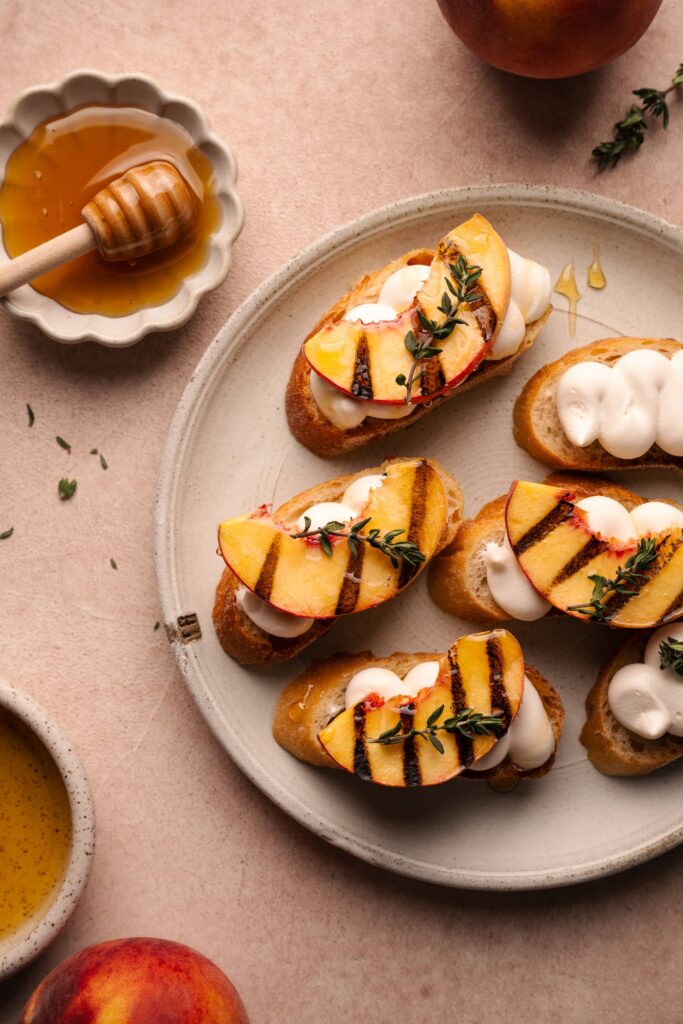
The Final Image
There you have it! There’s my very basic Lightroom editing workflow. Below is the before & after once again so you can really study the differences. If you have any questions, feel free to either email or DM me on Instagram! I hope this was helpful! 😊

So helpful! Thank you for sharing your process!!
This looks amazing!! Thanks for walking is through the process, now I want to try it for myself 🤓
Also would love to see more examples if you can show us 🫶🏼
This was really helpful. Thank you for sharing each and every step along with the Lightroom snapshots.